What do teachers make anyway?
Source: DESE
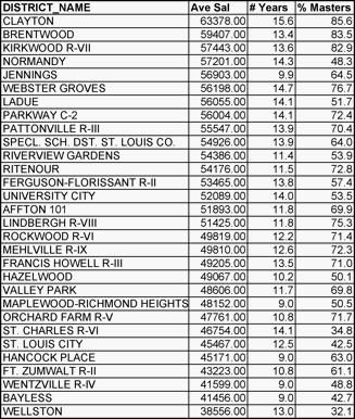
I assumed that Clayton would be the top-paying district in the county, and I was correct. The average is high because the district prioritizes experience and advanced eduction. The average number of years teaching is 15.6; while Webster Groves, the next highest, is 14.7—almost a year less.
Clayton, Brentwood and Kirkwood all have over 80 percent of teachers with at least a master's degree. They are also the highest paying districts. This is no coincidence as I found a .76 correlation between average salary and percent with a master's. This is much higher than the still statistically significant .40 correlation between average salary and average number of years teaching.
At a future date I will compare the percent with a master's to quality of schools because in looking at it, that seems to be a pretty good indicator, with Ladue as a weird outlier. (What's up with Ladue only having 50 percent of its teachers with a master's? They're not young (14.1). This deserves further research.)
Rhyme or reason to salary schedules?
The St. Louis Post-Dispatch provided an interesting graphic to accompany its Rod Jetton story which gave the district paying the most to beginning teachers and the district paying the least. I had assumed that Clayton would be the highest paying school, but I was wrong. Jennings. The lowest-paying district is Hancock Place. I wasn't surprised there. I ranked all of the districts and could discern no obvious pattern.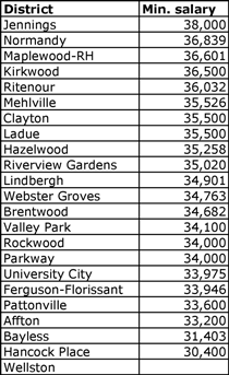
I wondered if Jennings was one of those districts that encourages beginning teachers by paying them well but doesn't reward its more experienced and educated teachers, so I also looked at maximum teacher salaries. Nope, Jennings is just a high-paying district.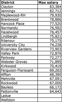
I wondered if the maximum salary was tied to the median income level of the district. Seemed reasonable that the districts in wealthier areas would pay more. With a correlation number of -.26 though, that's not the case. Other market factors are in play.
The spread between minimum and maximum salaries is important as teachers want to know that their salaries will increase. Quality Counts suggests a ratio of at least 2.0 The St. Louis districts do that to stay competitive even if the rest of the state does not (state average 1.66).
❝In fact, the salaries and career potential for teachers are remarkably flat: The average maximum salary that a teacher can earn is just 1.85 times the salary of a raw entrant, according to the National Center for Education Statistics, based on figures from the 2003-04 school year.❞
To get a better grip on which districts tighten their salary schedules, I ranked them and included whether each district has been named a district of distinction by Missouri based on MAP data.
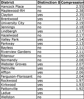
With Rockwood, Kirkwood and Pattonville the only districts under the 2.0 and on the bottom of the heap, I have to say that the compression ratio isn't the end all although I do think it's important. Studying all the districts of the state might show more of a difference rather than within a region or market area.
I ran some correlation numbers to try to figure out whether the compression ratio is more highly correlated to the maximum salary or the minimum.
Max. salary correlation .73
Min. salary correlation .24
Obviously it is tied to the max salary. Hancock Place did have the highest ratio with a low starting salary and high maximum salary. I was glad to see that the bad press it has received for its low starting salary isn't justified. Most of the time, however, low starting salaries meant little in terms of the ratio.
Summary
I doubt few prospective teachers compare salary schedules too closely as long as a district is within the regional norm, but I found it fascinating. Some of my assumptions were challenged, which will encourage me to dig deeper in the future.
Numbers from MSTA's salary schedule report