Wellston School District
District spending seems a bit random
09/08/08 15:08 Categories: Finances
A commenter to skoolboy’s post on the Chicago protest wondered if wealthier districts did a better job educating students eligible for free or reduced lunch. So I ran some St. Louis numbers. Nope.
There is no correlation between per pupil spending in a district and the percent of free or reduced lunch students who test proficient or advanced on the math MAP test. (-.24) There isn’t even a correlation between per pupil spending and the percentage of total students who test proficient or advanced on the math MAP test (-.04)
After looking at the numbers, however, I was surprised at the districts’ spending levels. Clayton having the highest spending is no surprise to anyone, but the number two district is Wellston, the district that has the lowest test scores in the county and that has lost its accreditation.
Does per pupil spending reflect a community’s wealth though? Not as much as we would expect. In fact, not at all. The correlation between per pupil spending and median household income is -.15 (This differs from skoolboy’s findings on Illinois and could from the state of Missouri, but I focused on the St. Louis metro area. I also didn’t use the exact same method he did.)
My next attempt to find a commonality was to draw a map. Bingo. I colored in the top third per pupil spending purple, mid third medium blue and bottom third yellow.
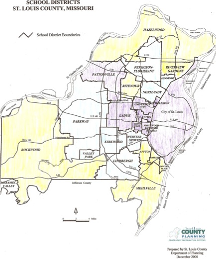
Since the city and middle corridor obviously spend more irrespective of community wealth, I hypothesize that the older buildings cost more to maintain. Obviously, teacher salaries could play a factor here too, but those are numbers to run another day.
I’m not arguing that since there’s no correlation, we should reduce funding for all the districts. However, we also can’t equate funding with equality as so many other factors come into play.
MAP scores highlight U.S. inequality
08/04/08 13:28 Categories: Assessment | NCLB
I am intrigued by the newly released Mo. MAP scores in a similar way to my fascination with political polling, complete with a need to understand the caveats and to dig deeper.
Fareed Zakaria, in The Post-American World, explains the U.S. math score mediocrity.
❝But even if the U.S. scores in math and science fall well below leaders like Singapore and Hong Kong, the aggregate scores hide deep regional, racial, and socioeconomic variation. [...] The difference between average science scores in poor and wealthy school districts within the United States, for instance, is four to five times greater than the difference between the U.S. and Singaporean national averages. In other words, America is a large and diverse country with a real inequality problem.❞
This inquality is highlighted in the St. Louis County MAP scores. The 10th grade math scores ranged from 81.4 percent of a school scoring proficient or advanced at Clayton to 0 at Wellston.
OK, that is pretty extreme. The top five scoring districts averaged 71.6 prof/adv.; while the bottom five districts (excluding Wellston) averaged 15.6. I excluded Wellston because it has had its accreditation stripped and students may go elsewhere. In fact several go to Clayton.
The elementary math numbers aren’t any better. I chose 5th grade because I felt that gave students several years to get used to testing. The top five districts averaged 75.02 prof/adv; whereas, the bottom five averaged 18.76.